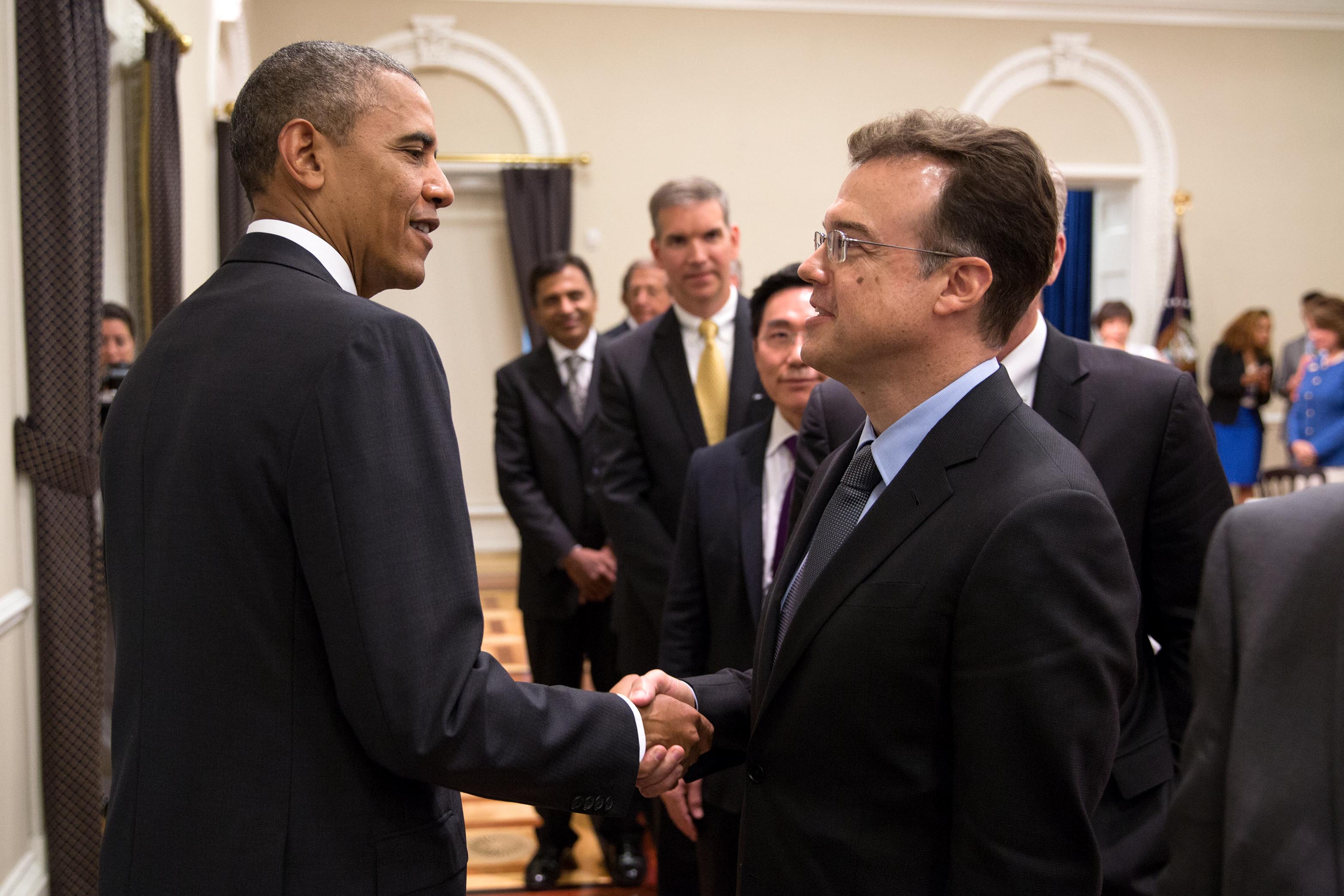
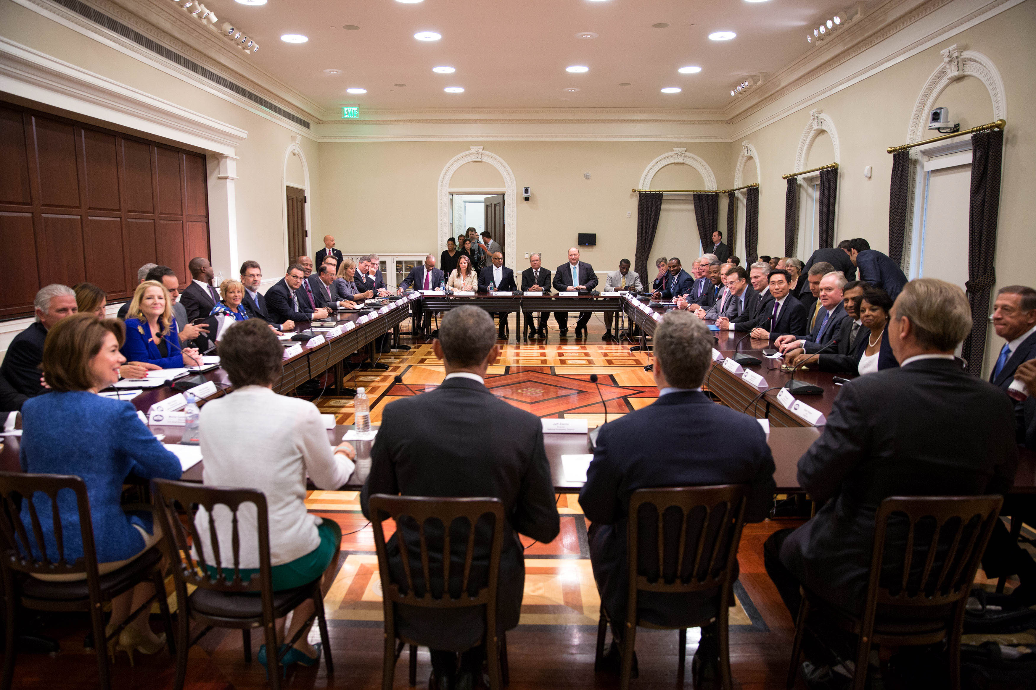
Interface Transitions
Oct 12 2009
One of the joys I experience as an interaction designer comes from observing a subtle element of an interface that plays a vital role in its effectiveness. Like a good movie soundtrack or the scenery for a stage play, an interface usually succeeds the most when it goes by unnoticed by its audience. Rarely do people leave a theater saying, “Wasn’t it great when the violins and the violas did the tremolo crescendo when the door was about to open?” or “Wasn’t it great how the forest colors mirrored the colors of the antagonist’s clothing?” That is, unless the audience member is a musician, a stage technician, or otherwise enlightened individuals, in which case they can smile privately to themselves at the observation, very much aware of the care that went into such details.
Often, when I enjoy the interaction of an interface it is due to a number of elements that were a part of my design training: interaction flows that match the tasks and goals of the user, typography and visual design that work well in concert and aptly support the brand being represented. But I recently noticed an element of design that I hadn’t considered in depth, and seemed to be absent from my training as an interaction designer. In this article, I hope to :
- Articulate the phenomenon
- Describe its different classes
- Provide good and bad examples of the phenomenon in the industry
- Show corollary examples in other fields
Interface Transitions
In the video below demonstrating the Google Map application on the iPhone, watch for the difference between Interaction 1 and Interaction 2:
Notice the difference? In Interaction 1, after the search was performed a number of pins dropped from the screen onto the map. In Interaction 2, the map with the pins appeared immediately.
Here’s another example: watch again for the difference between Interaction 1 and Interaction 2:
This time, the difference is even more subtle: when the menu is deselected in Interaction 2, the menu immediately disappears, while in Interaction 1, there is a slight fade that takes place.
What’s happening in these examples is a transition that is taking place between the states of an interface. The designer could have just taken the user from one state to another, but for one reason or another (which we will discuss later), a transition was put into place between these two states. I’d like to refer to this phenomenon as an interface transition, though as we’ll see later this concept is employed in fields besides interaction design.
Why Use Interface Transitions?
The first question that should be addressed when considering Interface Transitions is “Why?” After all, there are plenty of reasons working against them: it’s more work for the people building the application, and adds seemingly needless time to a task that a user is trying to perform.

Here are 4 reasons that interface transitions are employed in various scenarios:
- Creates a subtle effect that enhances the overall experience of an application subconsciously (discreet interface transition)
- Educates the user as to how a system works (educative interface transition)
- Introduces a recognizable effect for the user to perceive and enjoy (showcase interface transition)
- Masks the processing time (processing interface transition)
Discreet Interface Transitions
Discreet interface transitions are very subtle effects that go by unnoticed and aren’t really recognized unless they are missing. They don’t really serve any purpose in particular except to make an application “feel” good – smoother, less jarring, and fluid. Here are some examples of what I’d call discreet interface transitions:
Educative Interface Transition
Educative interface transitions are interface transitions that are trying to teach the user something without spelling it out literally for them. For example, look at this interaction:
What happened there? There aren’t any more photos to see. But how did we know that? The traditional way to address this scenario would be to either do nothing, or show a message informing the user that there were no more photos to view. But instead the photo just nudges back into place, a solution which outperforms both of the aforementioned alternatives: if nothing happened when the user tried to swipe to the right, then the user might thinking that perhaps the phone didn’t register their finger swiping across the screen, and try again. Delivering a message would work, but it degrades the overall experience by giving the user words to read when they’re in a mode of experiencing imagery, it communicates the negative feeling of receiving an alert of some sort, and it would likely require an extra step of dismissing the message.
Here’s another example of a very familiar educative interface transition:
When a menu option is selected, the screen slides left to make you feel like you are moving along a space. Whether we realize it or not, this interface transition helps to build in us a mental model of the iPod’s menu system so that we know what to do when we want to access another part of the iPod:

Showcase Interface Transitions
Showcase interface transitions are transitions that the designer intends for the user to notice and appreciate. As we’ll see later, there are some great examples of how this transition is abused, but for now we’ll focus on some good examples.
In this example from the game Bioshock, the player has simply switched from one type of weapon ammunition to another. But rather than just switch ammunition, the game designer put in a several second interface transition to achieve two goals. First, it enhances the feeling in the game that the user’s character is working with heavy machinery, contributing to the game’s overall “steam punk” atmosphere and adding a bit of realism. The second is that it introduces a significant delay that the user is all-to-aware of when they’re frantically trying to switch from one ammunition type to another during a heated battle. Indeed, this transition is so recognized by the gamer that it becomes an in-game factor to consider: “I could change to that ammunition, but it will take some time so perhaps I should stick with what I have.”
One area that’s full of showcase interface transitions are DVD and video game menus, when you go from the main menu into a sub-menu:
Again, the fastest and easiest thing to do would be just to show the relevant menu. However, in an attempt to make the user feel in the world of Star Wars, the designer has chosen to include a showcase interface transition.
Processing Interface Transitions
Perhaps the most well-known transition, processing interface transitions help to soften the blow when an activity requires the user to wait while something is working, processing, or loading. Unlike other interface transitions, where content is presented to the user by choice of the designer, often processing interface transitions are put in places where ideally they wouldn’t be needed at all.
Processing interface transitions can be just a simple loading screen, which just serves to let the user know that they need to wait:
Many loading screens in games take advantage of the fact that the player is staring at a screen by using the time to educate them about the game:
Loading screen from the video game Hellgate
Some games even provide a small mini-game to pass the time while loading!
Combining Interface Transition Types
As you may have noticed already, it’s possible for interface transitions to be more than one type of transition. For instance, the loading screen Kayak is both a processing interface transition and an educative interface transition because it lets the user know they need to wait but also lets the user know about all the sites that are being searched for tickets.
In fact, you could even go so far as to say it’s also a showcase interface transition because it shows off just how powerful the Kayak search engine is. One could argue that a search engine that’s clearly spending effort to scour each and every travel site on the web is more impressive than one that just zaps back your results quickly, just as a tightrope walker who looks transfixed in tense concentration will feel more impressive than one that casually strolls out on the tightrope.
Another example of a combined transition is the Apple’s Genie effect, which takes place when a window is minimized.
This acts as both a showcase and an educative transition. This effect was first introduced with the release of Apples “OSX” operating system, which included as one of its features increased graphics support from the operating system. The Genie effect was a great way to show this off, so much so that they included an easter egg that could let you really relish the effect (by holding the shift key while clicking the minimize button, the effect takes place in slow-motion).
One more thing worth noting about this interface transition is that it includes a way to actually let the user modify the effect.
OSX Dock System Preferences
By changing the option to minimze using the “Scale Effect” instead of the “Genie Effect,” the user is in effect able to change the interface transition from a showcase transition into a discreet interface transition. Perhaps some users found the transition to be too much, after using it for the hundredth time? This is a perfect segue to our next topic.
When Interface Transitions Go Wrong
Like any tool in the designer’s toolbox, it is possible to misuse interface transitions in a way that produces a negative effect. The most classic example are the infamous Flash-based introductions to web sites that were once so common. These were clear cases of showcase transitions that largely were frustrating because after the first viewing they became redundant, and while they were sometimes educational with regards to what to expect from the website, often they seemed to serve no purpose other than to show just how fancy the website was.
Restaurant review web site yelp.com has search results with a map that uses an interface transition that perhaps was intended to be discreet but in execution actually becomes a showcase transition: whenever you scroll down the search result, the map will eventually float down with you. The interaction concept at heart is solid: while people are looking at a particular restaurant, they would probably also like to see where it is on a map. The issue with the Yelp map, however, is that it moves too slow, and ends up making the site feel sluggish. One could argue that in fact the map shouldn’t ever scroll out of view, and should instead stay fixed in place while the content of the results scroll.
DVD navigation systems often contain over-the-top showcase interface transitions that make quick navigation a burden. Remember the aforementioned Star Wars DVD menu? It took about 7 seconds for one of the screens to load from the main menu. Now imagine that you’re trying to find the bloopers, but you can’t remember if it’s under the “Special Features,” “Bonus Materials,” or “Fun with Star Wars” menu. Going through each option becomes a lengthy process, and suddenly those slick interface transitions don’t feel so fun any more.
Interface Transitions in Parallel Fields
One of the things I find fascinating about the concept of interface transitions is the way that similar concepts seem to manifest themselves in other mediums. Take, for example, the concept in cinematography called “establishing shots,” where the camera shows the audience context for a scene before showing the subject. Here’s an example of a video clip without and with context:
Notice how, in the first clip, you don’t know where the person is. Is it a back yard? A park? Are they alone, or with other people? The second clip, with the establishing shot of the area around the tree, provides that context. One can imagine how a director can use this to sculpt an audience’s experience of a movie.
In a similar way, this is a cinematic equivalent to an interface transition, and can be broken down in a similar way: discreet transitions are context shots that go by unnoticed (think of the hundredth shot of the outside of Seinfeld’s apartment), educative transitions help give user context for the scene and set expectations for what might happen, and flashy action films can wow the audience with a fancy showcase transition to set the context for an action hero.
Classical music also has acoustic parallels to interface transitions. For example, consider the first movement from Beethoven’s 3rd Symphony. The opening of the first movement begins slow and somber:
Beethoven 7 – Opening of the First Movement
Would you believe that moments later, the audience will be hearing this?
Beethoven 7 – First Movement Theme
How will Beethoven take the listeners there? Sure, he could just throw them in, but instead he includes this prolonged, almost comical transition:
Beethoven 7 – First Movement Transition
Hallways in architecture, amuse-bouches consumed between meal courses, movements dance groups use to get from one arrangement to another on stage – all of these are “interface transitions” of their own sort in that they serve to connect experiences together.
Conclusion
In this article, I articulated a phenomenon called “interface transitions.” I detailed four different types of transitions (discreet, showcase, educative, and processing), providing good and bad examples of each. Finally, I showed some examples of these phenomena in fields other than interface design. In a future article, I’ll talk more about guidelines around interface transitions, and would appreciate any feedback others.
Can you think of other types of interface transitions? More interesting parallels of interface transitions in different fields? Or perhaps you might know of existing literature or studies around this phenomenon. In any case, please send me an email, or add a comment, and I’ll be happy to write a follow-up article!
- Corey


